¶ Building Dashboards
For admins. This page covers creating and configuring dashboards. For how end users read and use dashboards, see Dashboards.
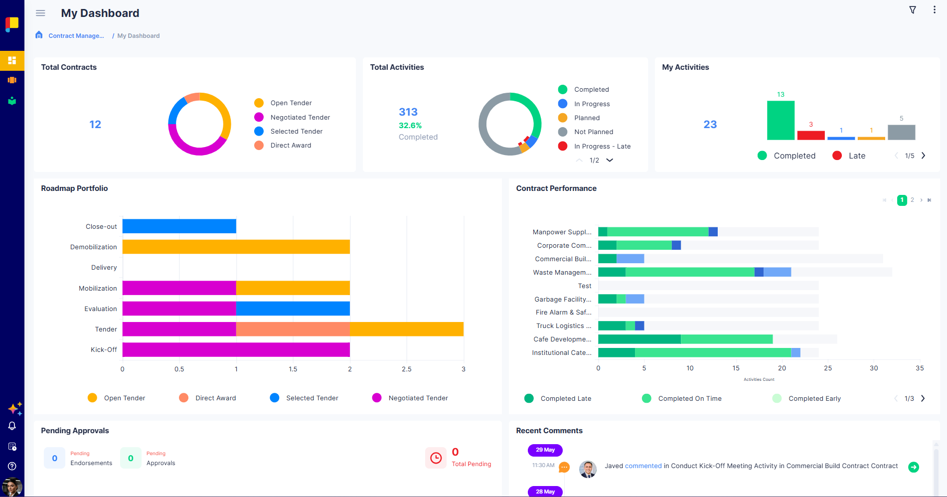
Dashboards turn live execution data into the views your teams rely on. As an Admin or Workflow Admin, you can create new dashboards for your workflow and choose which widgets appear—so leadership and teams see exactly the progress, risks, and priorities that matter.
Who can do this: Creating and configuring dashboards is restricted to Admins and Workflow Admins. Everyday users view dashboards (and can delete a dashboard from its own page).
¶ Why This Matters
- Give each audience the view they need—portfolio health, team workload, or pending decisions.
- Surface execution signals (late activities, pending approvals) where people will see them.
- Standardise reporting across projects without manual spreadsheets.
¶ Creating a Dashboard
You can add a dashboard in two places:
- Click the (+) next to the Dashboards menu item.
- From View All Dashboards (admin only), which appears once a workflow has many dashboards.
Then:
- Enter a name and, if applicable, a description.
- Add and arrange widgets (below).
- Save the dashboard.
To remove a dashboard, open it and use the delete option on its own page.
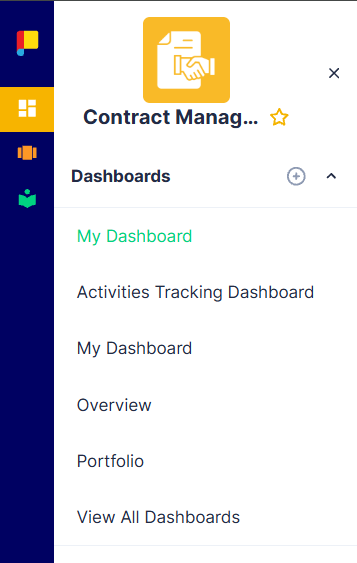
New dashboards are visible to all users with access to the workflow — they aren't scoped to specific roles.
¶ Widgets
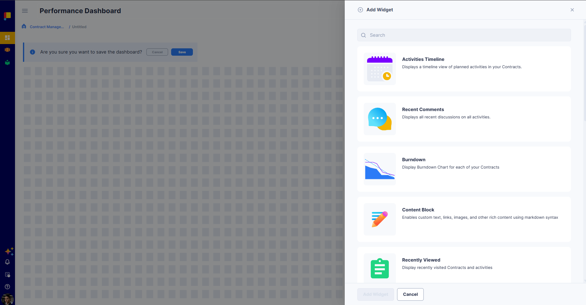
Dashboards are built from widgets. Click + Add Widget, then pick from the catalogue (use the search box to find one quickly). Each widget shows a different slice of your live execution data.
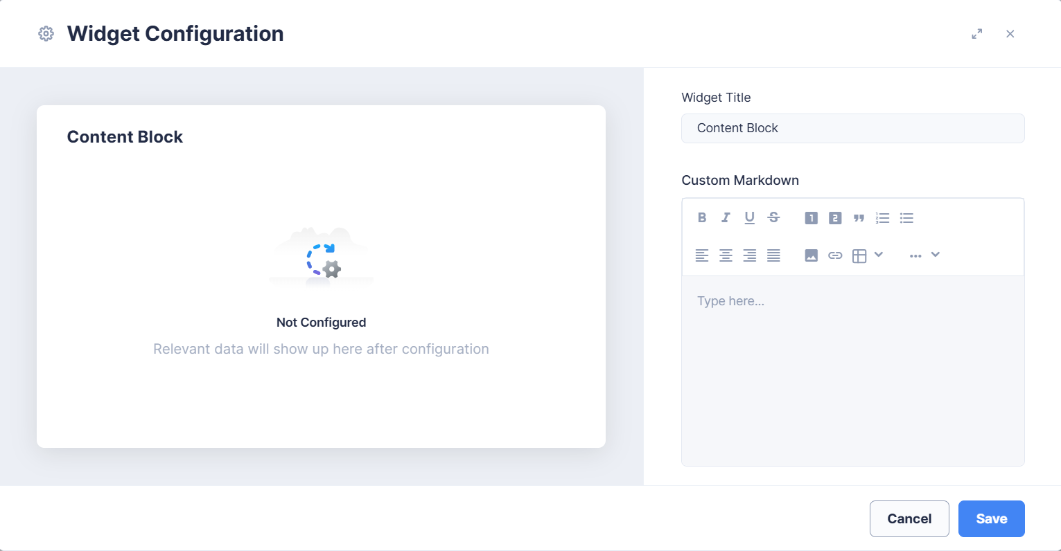
Configuring widgets: Only Content Block and Query Tile have detailed settings. Every other widget is not configurable beyond its Widget Title — open its Widget Configuration to rename it; the data it shows is fixed.
¶ Standard widgets
These widgets pull live data automatically. You can rename each one but cannot change what it displays.
| Widget | What it shows |
|---|---|
| Total Projects | The total number of your projects, with a donut breakdown by project. |
| Total Activities | The total number of activities across your projects, with the percentage completed and a donut breakdown by status. |
| My Activities | The status of the activities assigned to you (for example, Completed vs Late). |
| Project Performance | A detailed, per-project breakdown of activity status across all your projects. |
| Roadmap Portfolio | Your projects organised by roadmap and current phase, shown as stacked bars. |
| Project Tags | A treemap of all tags used across your projects. |
| Activities Timeline | A calendar timeline of planned activities in your projects, grouped by category and month. |
| Burndown | A burndown chart for a selected project, with total completed, total remaining, and total scope. |
| Pending Approvals | Your activities pending endorsement and approval, with running counts and an exportable (XLSX/CSV) table. |
| Recent Comments | A live feed of the most recent discussion comments across all activities. |
| Recently Viewed | The projects and activities you visited most recently, for quick access. |
¶ Configurable widgets
| Widget | What it does |
|---|---|
| Content Block | A static rich-text block for adding headings, instructions, notes, links, or images to a dashboard. Written in a Custom Markdown editor; shows exactly what you type. See Content Block widget. |
| Query Tile | Runs a live query and displays a single number with drill-down — add as many as you like and configure each independently. See Query Tile widget. |
¶ Content Block widget
A Content Block is a static rich-text widget — use it to add headings, instructions, context, or links to a dashboard. It does not show live data; it displays exactly what you type.
In Widget Configuration you set:
- Widget Title — the heading shown on the tile.
- Custom Markdown — the body, written in a rich-text editor with bold, italic, underline, and strikethrough; ordered and unordered lists; headings; text alignment; links; tables; and images.
¶ Query Tile widget
A Query Tile turns a query into a single headline number on your dashboard, with drill-down into the records behind it. Add a tile with + Add Widget, open Widget Configuration, and set the fields below.
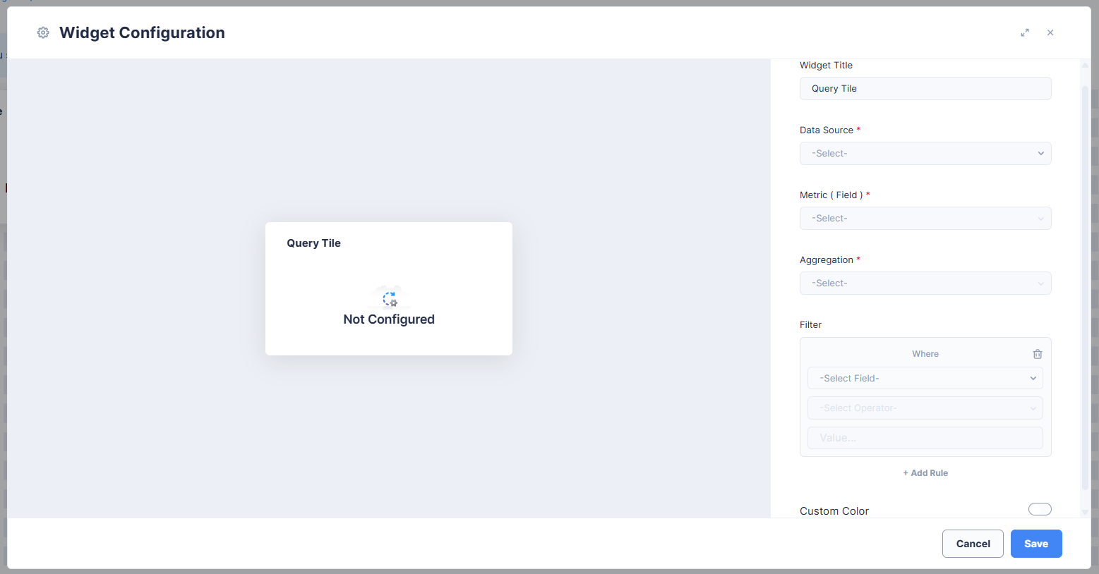
A tile is defined by three required settings — Data Source, Metric (Field), and Aggregation — plus an optional Filter. The settings build on each other, so configure them in order.
¶ 1. Data Source (required)
Choose what the tile counts or measures. Data Source is a fixed dropdown:
- Projects
- Activities
- Users
¶ 2. Metric (Field) (required)
Pick the field the aggregation runs on. The available fields depend on the Data Source you selected, and Planally shows friendly names in the dropdown:
| Data Source | Fields (as shown in the dropdown) |
|---|---|
| Projects | ID, Created Date, Project Settings Update Date, Last Updated Date |
| Activities | ID, Created Date, Updated Date, Planned Start Date, Planned End Date, Actual Start Date, Actual End Date |
| Users | ID, Created Date, Updated Date, Last Login Date |
¶ 3. Aggregation (required)
Choose how the field is summarised. The tile displays the result as its number.
| Value | Shown as |
|---|---|
| COUNT | Count |
| COUNT DISTINCT | Distinct Count |
| SUM | Total |
| AVG | Average |
| MIN | Minimum |
| MAX | Maximum |
Which aggregations are available depends on the type of the field you chose:
- Numeric fields — Count, Distinct Count, Total, Average, Minimum, Maximum (all options).
- ID fields (and any text/string field) — Count only.
- Date fields — Count, Minimum, Maximum.
¶ 4. Filter (optional)
Narrow the records the tile measures. Each rule is Field + Operator + Value, the same way the table filter works:
- The first rule is a Where condition. Add more with + Add Rule; each additional rule gets a connector you set to AND or OR, so you can build grouped logic. Remove a rule with the trash icon.
- The Field dropdown offers more than the metric fields. The available fields depend on the Data Source:
- Projects: Name, Current Phase, Status, Roadmap, Accessibility, Tags, ID, Users.
- Activities: Activity Name, Status, Phase, Swimlane, Applicability, Template, Priority, Created Date, Updated Date, Planned Start Date, Planned End Date, Actual Start Date, Actual End Date.
- Users: Created Date, Updated Date, Last Login Date.
- The Operator depends on the field — for example Is for an exact match, or Contains for text and tags.
For date fields, the value can be either a preset time range or a custom date you enter:
- Preset time ranges: Today, Yesterday, This Week, Last Week, This Month, Last Month, This Year, Last Year, Last 7 Days, Last 14 Days, Last 30 Days, Last 90 Days.
- Custom date: enter a specific date.
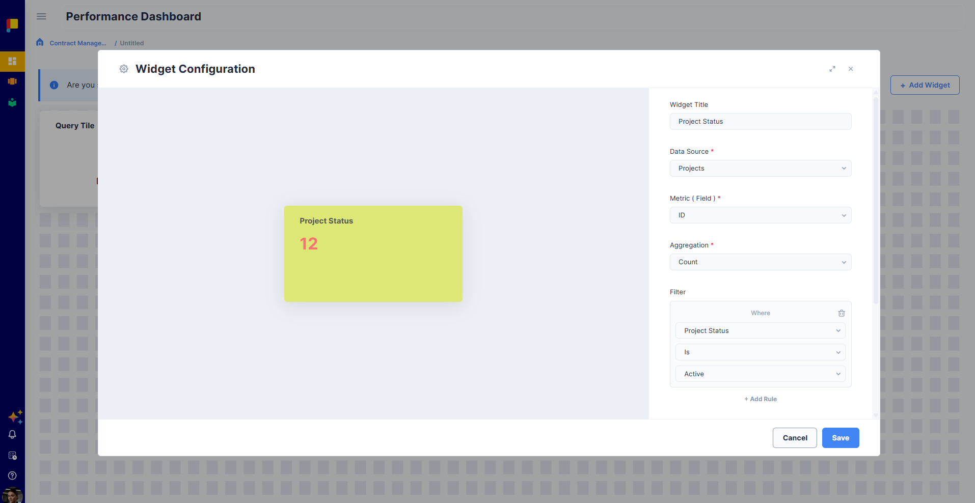
Example. A tile titled Completed Major Projects uses Data Source Projects, Metric ID, Aggregation Count, with the filter: Where Roadmap Is "Major" AND Status Is "Completed" AND Tags Contains "Oil". The tile shows the resulting count.
¶ Appearance
Turn on Custom Color to set the tile's Title Color, Value Color, and Background Color from the swatches (or click + to add your own). Give the tile a clear Widget Title so its number is self-explanatory.
¶ Saving and drilling down
Save the tile to add it to the dashboard, then position and resize it on the layout. Once live, select the tile's number to drill down into the underlying records it was calculated from — drill-down opens exactly the records counted in that number, nothing more. If the tile shows 5, drilling down shows those same 5 records.
Query Tiles — and dashboards generally — respect each user's own access permissions. The same dashboard filters its data differently per viewer, showing only the projects and activities that user has access to.
¶ Best Practices
- Build a focused dashboard per audience rather than one crowded view.
- Use a Content Block to label sections and explain what a dashboard is for.
- Use Query Tile widgets for the headline numbers people check most often, and rely on drill-down for the detail.
- Keep each Query Tile to one clear metric; add more tiles rather than overloading one.
- Put Pending Approvals and My Activities where owners will see and act on them.