¶ Form Builder
The Form Builder is where you design custom templates that drive the forms users complete inside activities. Drag and drop the fields you need, configure how each one behaves, preview the result, and publish the template for reuse across your workflow.
¶ Why This Matters
Form Builder lets you:
- Standardise data capture across every activity that uses the template.
- Tailor forms to your process—no developer needed.
- Govern with confidence—required, read-only, and structured fields keep submissions consistent.
- Save time with predefined lists—drop in ready-made option sets for common fields.
- Iterate quickly—preview before saving, edit anytime, reuse one template across many activities.
¶ Where to Find It
Open the Form Builder when you create or edit a custom template:
- Open your workflow.
- Go to Configuration → Projects → Templates.
- Click Add New Template, or click an existing Custom template to edit it.
The Form Builder opens full-screen with the template's name editable in the Form Name field.
¶ The Three Modes
- Form Builder (default) — the visual drag-and-drop editor.
- Preview — see the form exactly as users will see it. Use before saving to spot layout issues.
- Code Editor — edit the underlying form schema directly. Reserved for advanced cases.
Switch between modes anytime—your work is preserved. Use Cancel to exit without saving, or Save & Close to publish.
¶ Form Elements
Drag any element from the Form Elements panel into your form. Forms always start with a default Section container; add more sections to group fields under separate headings.
| Element | Use it for |
|---|---|
| Input Field | Single-line text such as names, codes, or short references. |
| Text Area | Multi-line text such as descriptions, notes, or findings. |
| Date | A date picker with calendar selection. |
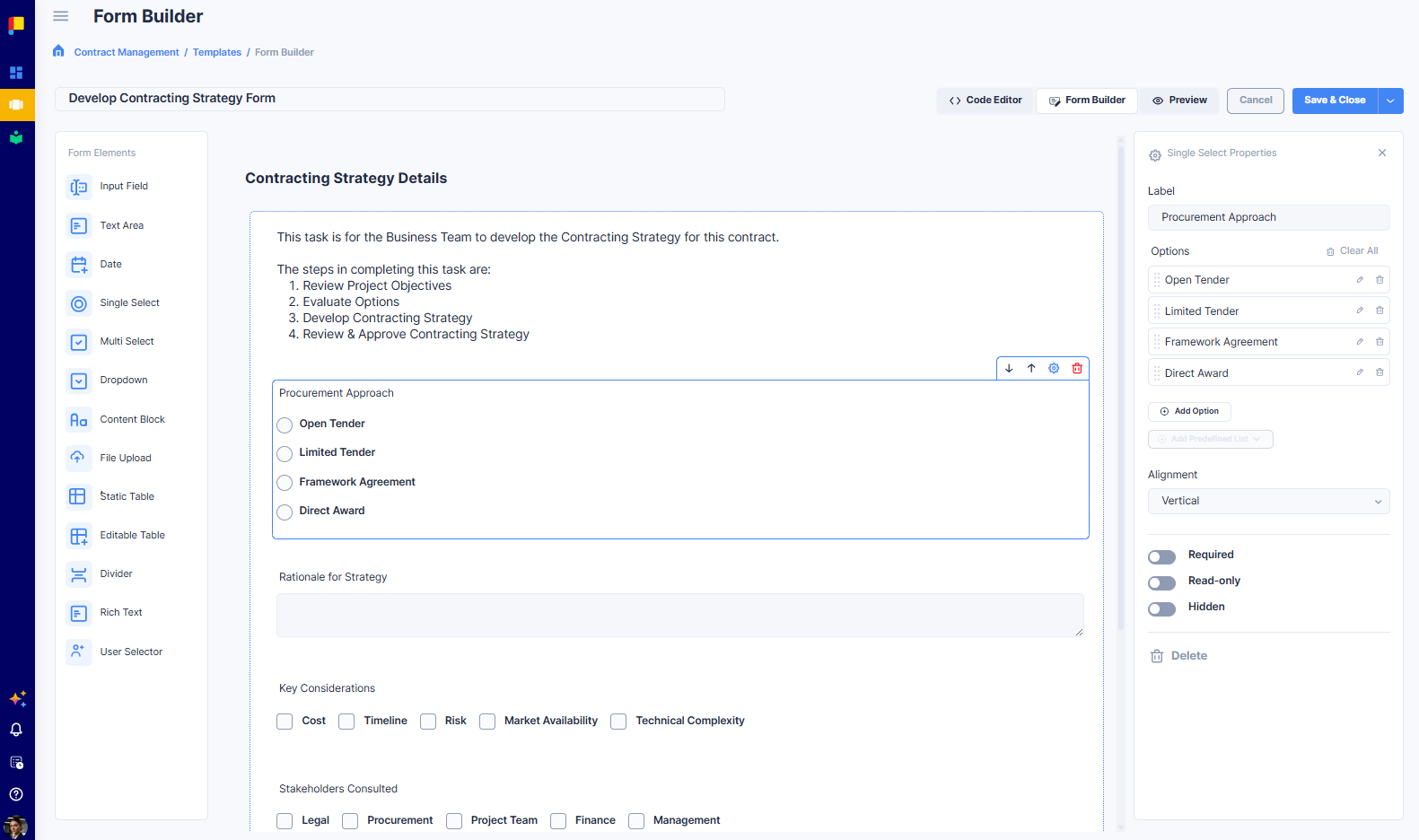
| Single Select | One choice from a short list (radio buttons). Supports predefined lists. |
| Multi Select | Multiple choices from a list (checkboxes). Supports predefined lists. |
| Dropdown | One choice from a longer list, in a compact dropdown. Supports predefined lists. |
| Content Block | Static text or instructions for the form filler (rich formatting). |
| File Upload | Lets users attach files. Restrict by type (Documents, Images, Videos). |
| Static Table | Embed a structured data table inside the form (read-only layout). |
| Editable Table | A table users fill in row by row inside the form—add, edit, and delete rows (a form within a form). |
| Divider | A visual separator between groups of fields. |
| Rich Text | A free-form rich-text editor users complete inline. |
| User Selector | Pick one or more users from the project team or organisation. |
Note: There is no standalone Checkbox element. For a yes/no toggle, use a Multi Select with one option, or a Single Select with two options.
¶ Configuring an Element
Click any element on the canvas to open its Properties panel. Common toggles:
- Label — the name users see above the field.
- Required — makes the field mandatory before the activity can be saved.
- Read-only — locks the field for viewing only.
- Hidden — hides the field from users by default.
¶ Select-type elements (Single Select, Multi Select, Dropdown)
- Add Option — add choices manually (each with edit, delete, and a drag handle).
- Add Predefined List — ready-made option sets: Gender, Currency, Honorific, Marital Status, Language, Time Zone, Country.
- Alignment — display options vertically or horizontally.
- Pre-Select Option — the option selected by default.
¶ Content Block
- Edit Content — opens a rich-text editor (headings, lists, quotes, images, links, tables).
- Content Area Height, Editable (off by default), Hidden.
¶ File Upload
- Label, Placeholder Text, Upload Button Text (default: Choose File).
- Accepted File Types — restrict to Documents, Images, or Videos.
- Required / Hidden.
¶ Static Table
- Table Section Title, Edit Table (define columns/rows), Hidden.
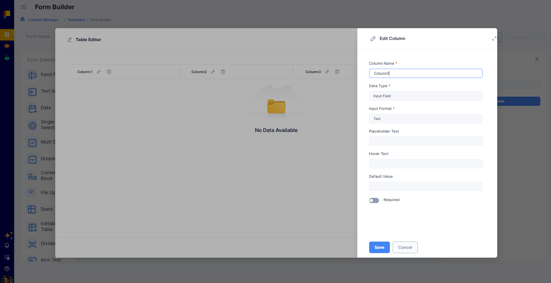
¶ Editable Table
The Editable Table lets the form filler add and edit rows inside the form—a form within a form. You define the columns (each is its own field), and users add as many rows as they need, filling in each field per row.
- Table Section Title — the heading shown above the table.
- Add Columns — add fields to the table. Each column can be one of these field types:
- Text
- Number
- Text Area
- Date
- Single Select
- Multi Select
- Dropdown
- Attachment
- User Selector
- Required / Hidden toggles.
Once published, users can add, edit, and delete rows in the table while completing the activity.
¶ Rich Text
- Label / Placeholder Text, Height, Required / Read-only / Hidden.
¶ User Selector
- Label / Hover Text, Selection Type (Single or Multiple), User List Source (Project Users or All Users), Required / Read-only / Hidden.
¶ Building a Form: Step by Step
- Name your form in the Form Name field.
- Add elements by dragging from the left panel into the default Section.
- Add more sections for grouped headings (sections appear as left-side navigation in preview).
- Reorder elements by dragging on the canvas.
- Configure each element in its Properties panel.
- Use Predefined Lists where they apply (Country, Language, etc.).
- Add Content Blocks and Dividers to group fields and add guidance.
- Preview to see the form as users will.
- Save & Close when ready.
¶ Best Practices
- Keep labels short and clear.
- Use Required sparingly—only for fields without which the activity is incomplete.
- Reach for Predefined Lists first for cleaner reporting later.
- Group related fields with a Divider and a Content Block heading, or multiple Sections.
- Use Content Block for instructions you author once; Rich Text for answers users write each time.
- Restrict File Upload by type to prevent accidental uploads.
- Pick the right User Selector source—Project Users for assignees, All Users only when org-wide.
- Preview before saving.